A Sci-fi Masterpiece - The Expanse

Source: Amazon Prime
The Expanse
“The Expanse” is a science fiction television series based on the book series of the same name by James S.A. Corey (the pen name for authors Daniel Abraham and Ty Franck). Set in a future where humanity has colonized the solar system, the series explores the political, social, and technological challenges faced by various factions as they navigate the complexities of space exploration, colonization, and interplanetary conflict.
The show first aired on December 14, 2015, with the premiere episode titled “Dulcinea.” The series originally aired on the Syfy network in the United States. It premiered as a two-episode pilot event, with “Dulcinea” followed by the second episode, “The Big Empty,” on the same night. Since then, “The Expanse” has continued to air subsequent seasons, gaining a dedicated fanbase and critical acclaim for its storytelling, world-building, and visual effects.
I really love this show because of the attention-to-detail, which in this show is unparalleled. See for yourself what astrophysicists and astronauts have got to say about “The Expanse”:
Astronaut Chris Hadfield reviews ‘The Expanse’
Skip to 12:02 minuites for the review directly.
Astrophysicist Dr. Becky Smethrust reviews ‘The Expanse’
Catch Dr. Becky reviewing ‘The Expanse’ in her youtube channel where she highlights the the level of detail in this show.
The Data
Actually, I was enthralled by the first and second episodes to an extent where I tabulated data as I watched the rest of the show, in Microsoft Excel and categorized them per each season. I have tabulated my favorite characters from each season, the ships, minute details fo each celestial objects as the plot unfolds. Took around 3 weeks 2 days precisely. Moreover, I had to search inside IMDB website for the show’s ratings dataset and I used that data in this visualization.
Cleaning
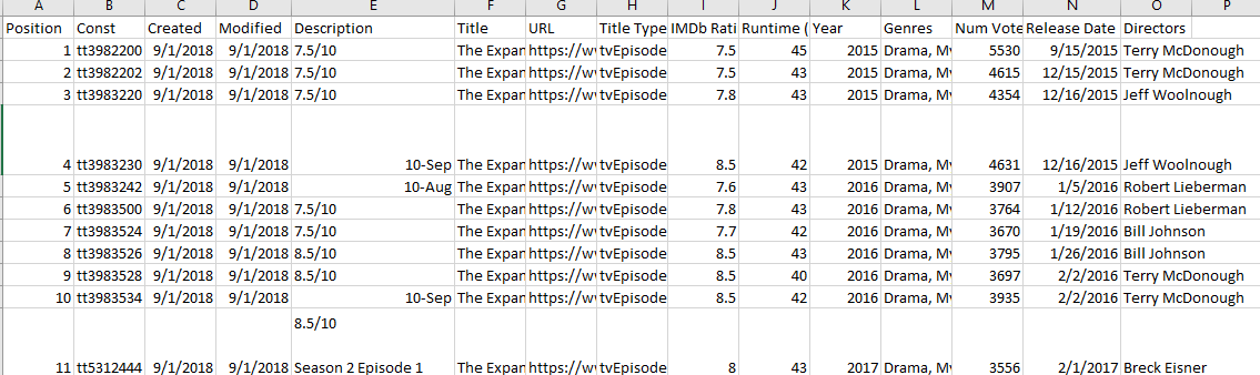
The IMDB ratings dataset for the series is available through here. I exported into a spreadsheet. Once, I opened the sheet, I quickly looked at rows and columns and found some cells have bad data like in the below picture:
I formatted the dates selecting pertinent column, here it is “release date” and selected entire rows using excel shortcut Left ctrl+Shift+down arrow(⬇️). Then, I went to ‘format cells’ and selected proper date format “mm/dd/yyyy”.
Now, another important task is to extract season & episode numbers from description column. For this, I used the following function and syntaxes:
I noticed for the season 1, this problem is not there. So, I just manually assigned my season-episode for season 1 only. I used the above syntax for rows pertaining to season 2 and onwards till season 6.
Further, I extracted episode from the description column and used ‘CONCAT()’ to join both cells as:
Now, I can work with this dataset.
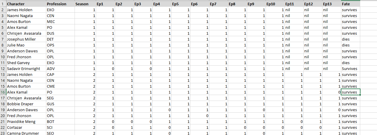
Regarding my dataset which I created, I tabulated in the following manner as I watched all episodes:
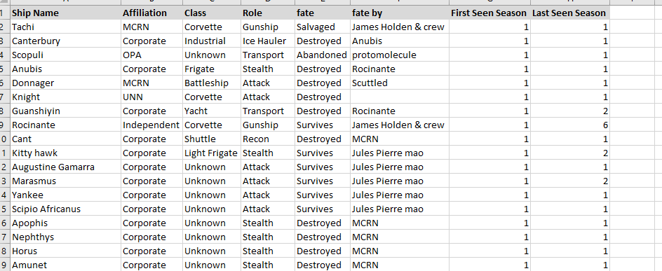
I made new sheets with codes and other information as follows:
and,
Organizing
In tableau, I created unions and mapped the database by common columns and the map looks something like this:
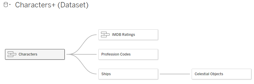
Once I organized each sheet from my dataset with mapping common columns, I worked on creating the visualization.
Visualization
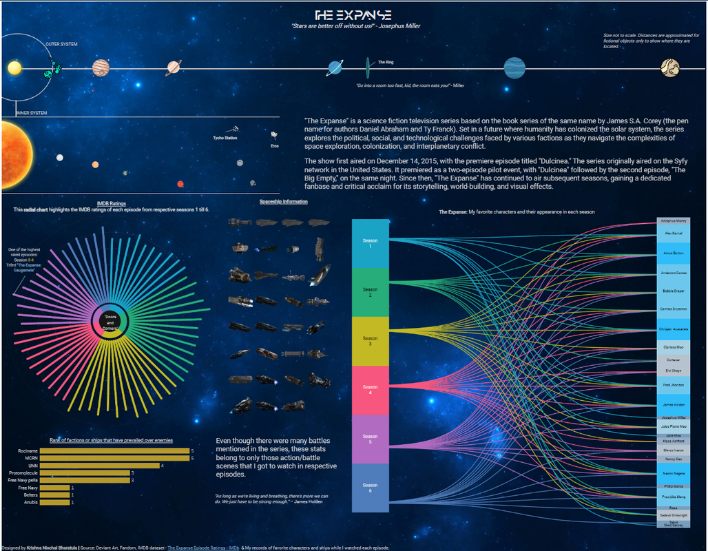
I came up with lot of ideas in visualizing this dataset that is both interactive and fun to look at data. One stunning aspect of the series as pointed out by the astronauts and astrophysicsts is the physics aspect of space and time. So, when you watch the series you will find how distant each celestial object is and the times they have included in trasmitting any message withhin the show as the plot goes on (they actually pointed out that 27minutes of time delay of message from Martian leaders and 6 hours of time delay from marines in Jupiter/Saturn).
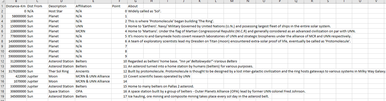
This drove me to create a dataset with actual distances of objects in space using ‘Astronaumical Units’ as measurement of distance. For the ‘Sol Ring’ or ‘The Ring’, the show said “Sol Ring - in stable orbit beyond Uranus”. I came up with a fictional number and incorporated in my dataset.
Chart Selection
I utilized ‘Starburst chart’ and ‘Sankey Chart’ to visualize my data while enabling me to tell a better story and information for the viewers. While starburst chart highlights rating details and meta data of each episode, the sankey chart tells which characters starred in each season. The same characters appeared in other seasons too. I couldn’t find a better chart than this one. Sankey chart works best for data having a flow of information.
For ships data, I simply used a bar chart that highlights which ships had the highest kill streaks or ‘splash’ count.
Thus, here is my viz’
Dashbaord Link: The Expanse Dashbard.
Acknowledgements
I must thank the whole team of ‘The Expanse’ for entertaining me. While the show was being aired, the cast were doing live sessions talking to the fans and having fun. I got a chance to look back at the videos for a brief amount of time. Actually, I watched this show for the 6th time!
I thank Fandom and IMDB for the data and ship icons. I do not have any rights over the imdb ratings data and ships design or icon files. All the rights are with Fandom, IMDB and Alcon Television Group who produced this show. I just used what was publicly available. If anyone finds this as a breach, please let me know through here LinkedIn.
I created this viz for improving my data analytics skills and NOT for any promotional purposes. Do follow Fandom, IMDB and Alcon Entertainment for more details about the show.
I thank Trevor Maxwell for helping me in making the sankey chart better.
Thank you for taking time in reading this article and do let me know what you think about the viz by reaching out to me through LinkedIn.
If you like the viz, please don’t forget to nominate the viz for ‘Viz Of The Day’.
Another viz done for the day!